classic book cover redesigns
The intention behind this project was to redesign a series of classic novel covers for a modern digital audience viewing the books through streaming and eBook platforms such as iBooks. The project focused on creating visually engaging yet simplified cover designs that could quickly capture attention within digital storefronts while still reflecting the emotional depth and symbolism of each story. The redesigns aimed to modernize the presentation of these literary classics while maintaining respect for their original themes, atmosphere, and narrative identity.
Design Decisions
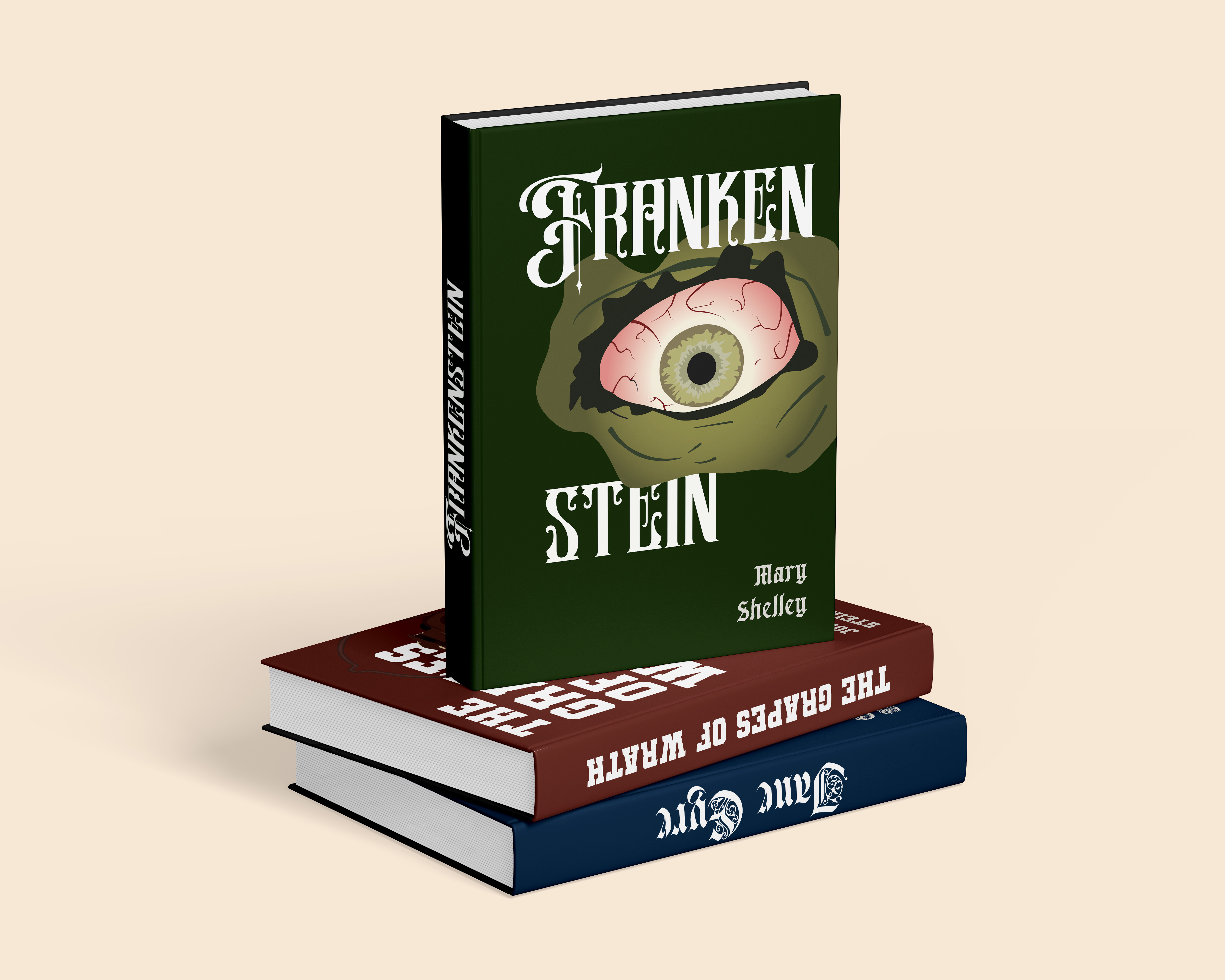
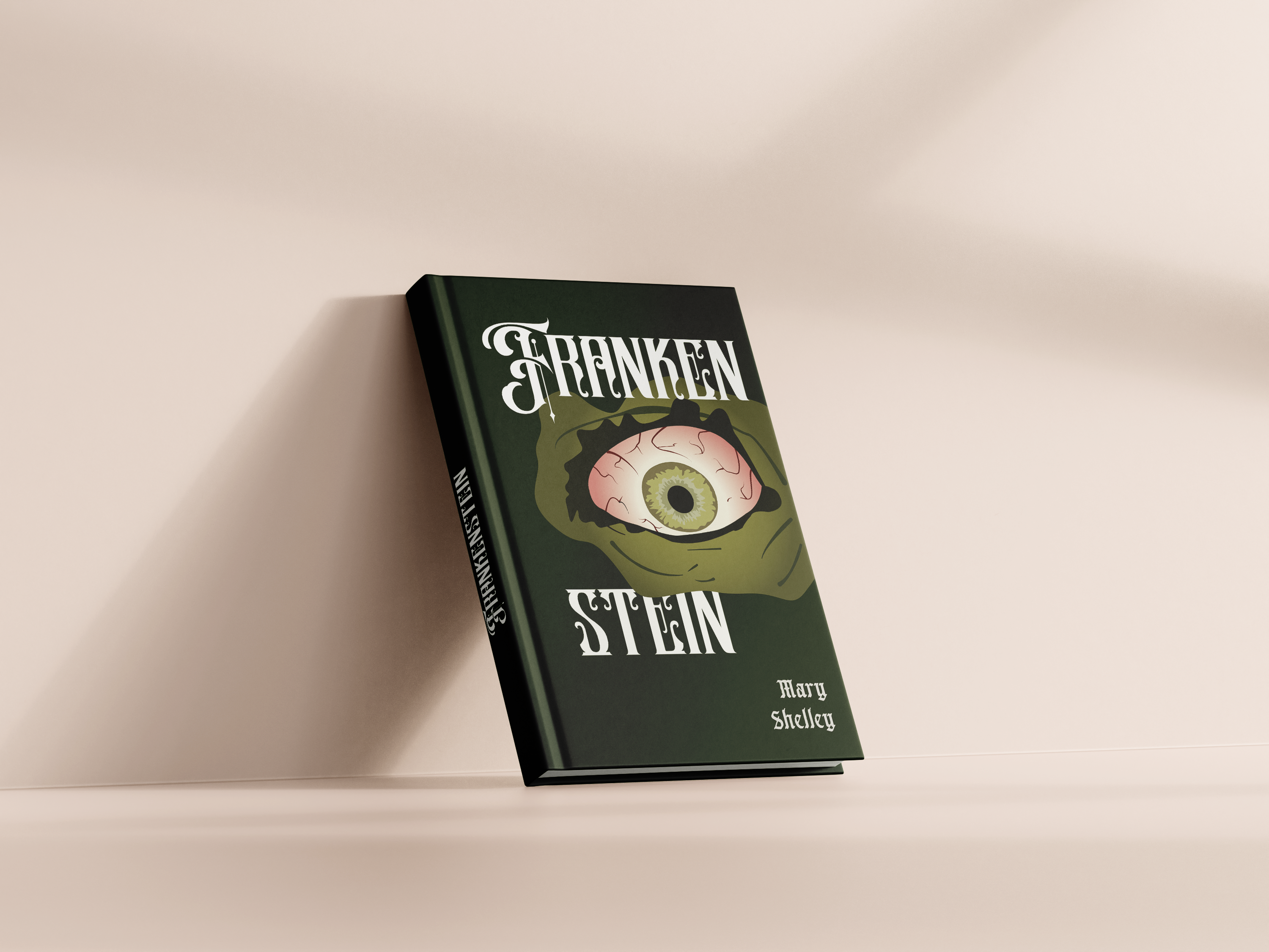
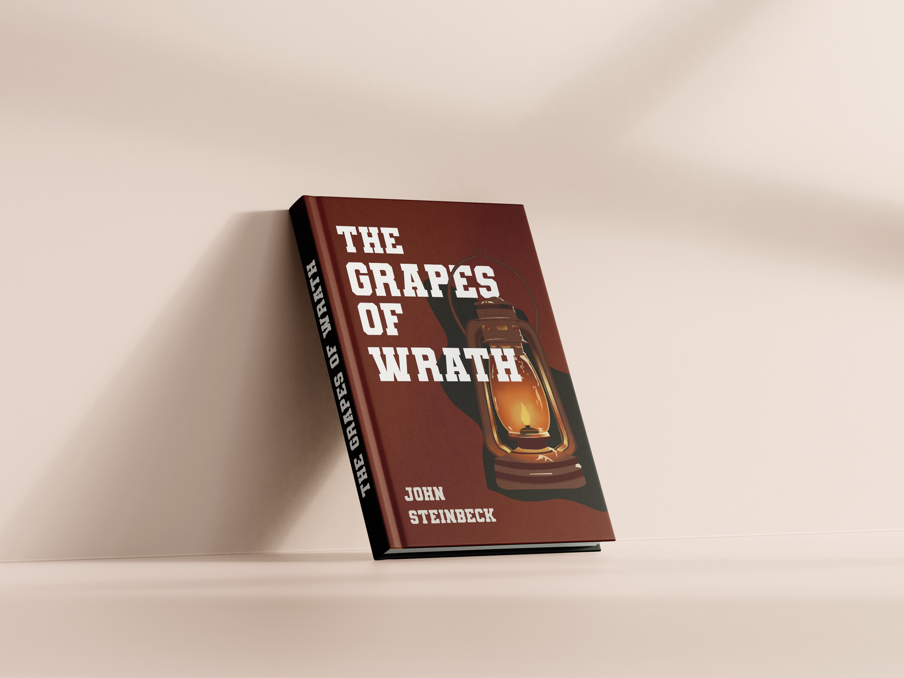
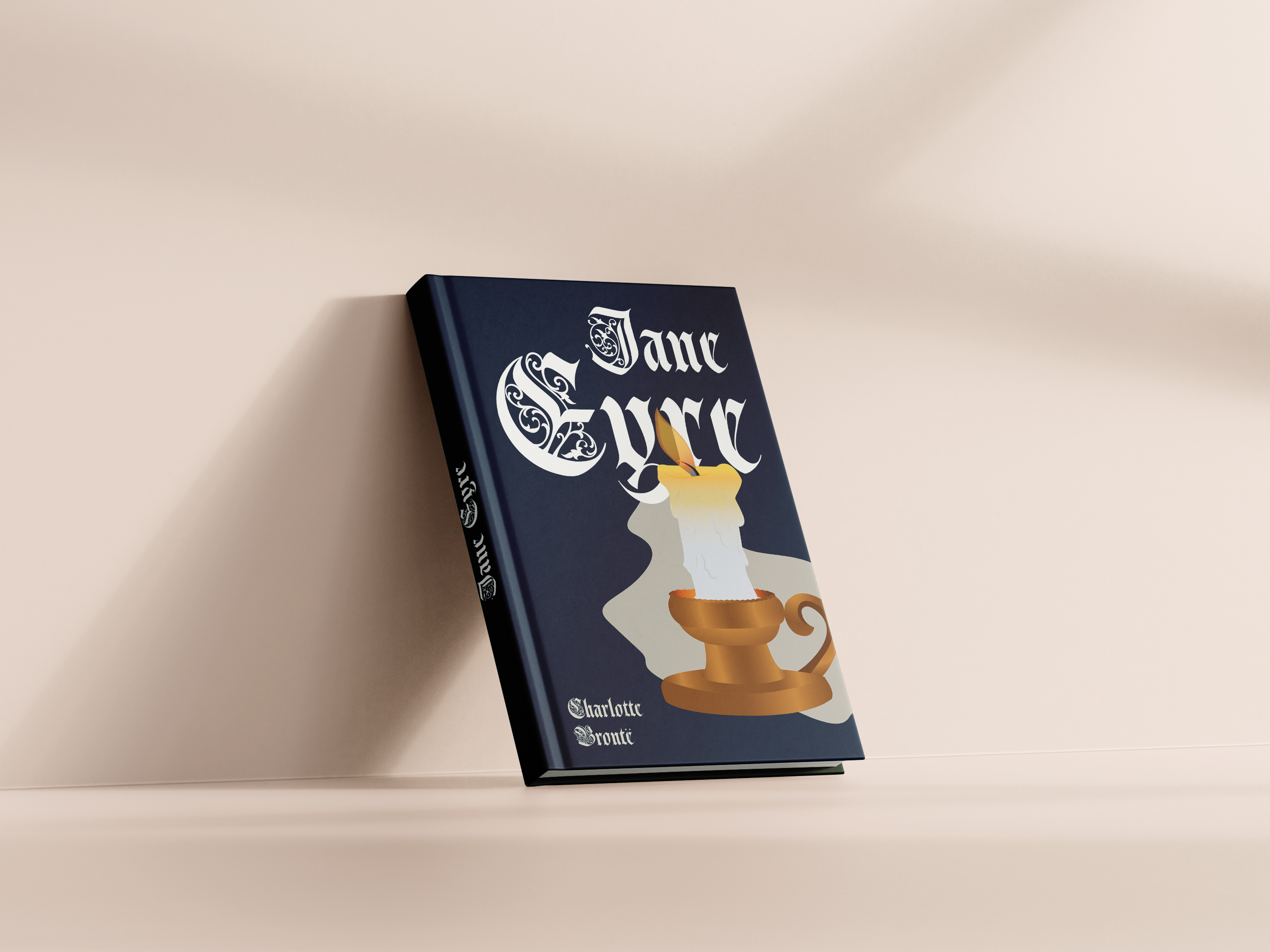
The design decisions throughout the project focused heavily on symbolism, colour psychology, hierarchy, and thematic typography. Each book utilized colour palettes and visual tones intended to reflect the atmosphere and emotional identity of its narrative. The Grapes of Wrath incorporated rust and barn-inspired tones to represent themes of rural hardship, migration, and aging machinery, while Jane Eyre used darkened regal blues to emphasize themes of class, isolation, and emotional restraint. Frankenstein adopted a cinematic green tone associated with modern cultural depictions of the creature, balancing audience familiarity with references to the novel’s gothic and scientific themes.
Typography became a major storytelling element throughout the series, with each typeface carefully selected to reflect the setting and emotional tone of its respective novel. Jane Eyre utilized elegant, flowing typography to reinforce themes of classism and historical refinement, while Frankenstein incorporated a more rustic and technologically gothic typographic style reflective of its themes of scientific experimentation and unnatural creation. In contrast, The Grapes of Wrath utilized typography inspired by rural typewriter aesthetics to emphasize the novel’s grounded and working-class atmosphere.
To unify the series visually, each design positioned the primary imagery toward the right side of the composition with overlapping typography to create a sense of layering and depth. This approach helped maintain cohesion across all three covers while allowing each design to retain its own unique narrative identity.
The development of the series began through research into the novels’ cinematic depictions, recurring symbolism, and emotional themes. Rather than illustrating multiple scenes or characters from each book, the design direction focused on identifying one central visual element capable of encapsulating the core emotional and narrative identity of each story.
Concepts of longing, turmoil, isolation, and hope became recurring themes throughout the series, leading to the exploration of shadows, fire, atmospheric lighting, and symbolic imagery.
Each cover was intentionally designed to feel connected as part of a unified collection while still visually representing the individuality of each novel. Early concepts explored balancing strong visual storytelling with typography in a way that allowed both elements to coexist without overpowering one another
Initital Concepts
Final Design
The final redesigned book cover series explored how classic literature can be visually reintroduced to contemporary digital audiences through modernized symbolism, atmospheric storytelling, and intentional typography. By balancing simplicity with emotionally driven visual design, the project aimed to create covers that remained recognizable and engaging within modern digital marketplaces while still respecting the themes and emotional depth of the original novels.
Through cohesive layout systems, symbolic imagery, and carefully curated typography, the series demonstrates how editorial and publication design can reinterpret classic literary works in a way that feels visually compelling, contemporary, and emotionally connected to modern audiences.


REAL
IDEAS MADE
kaitlyncutting12344@gmail.com
Location
Ontario, Canada