magazine covers
gq and vogue
The objective of the magazine spread assignment was to design editorial layouts inspired by the visual identity and audience expectations of established publications such as GQ and Vogue. The project challenged designers to explore how typography, hierarchy, composition, and imagery work together to communicate tone, style, and audience engagement within a professional publication setting.
Through the creation of visually distinct spreads, the assignment emphasized balancing readability with strong visual storytelling while adapting design decisions to reflect the personality of each magazine brand. The project explored how editorial design can influence the viewer’s perception through pacing, layout structure, image treatment, and typographic expression while maintaining a cohesive and publication-ready appearance.
Designing for a Vogue-inspired editorial layout required careful attention toward elegance, hierarchy, and the balance between imagery and negative space. Unlike more information-dense magazine styles, Vogue layouts often rely heavily on sophisticated typography, large-scale photography, and minimal yet intentional composition to create a sense of luxury and refinement. Because of this, the design needed to avoid visual clutter while still maintaining strong flow and readability throughout the spread.
Special consideration was also given to typography selection, spacing, and pacing within the layout. The editorial structure emphasized refined serif typography, strong image dominance, and carefully controlled alignment systems that allowed the visuals to feel immersive and fashion-oriented while maintaining a polished and publication-ready appearance. Overall, the project explored how subtle layout decisions, spacing, and visual restraint can communicate sophistication and strengthen the emotional tone of an editorial design.
vogue
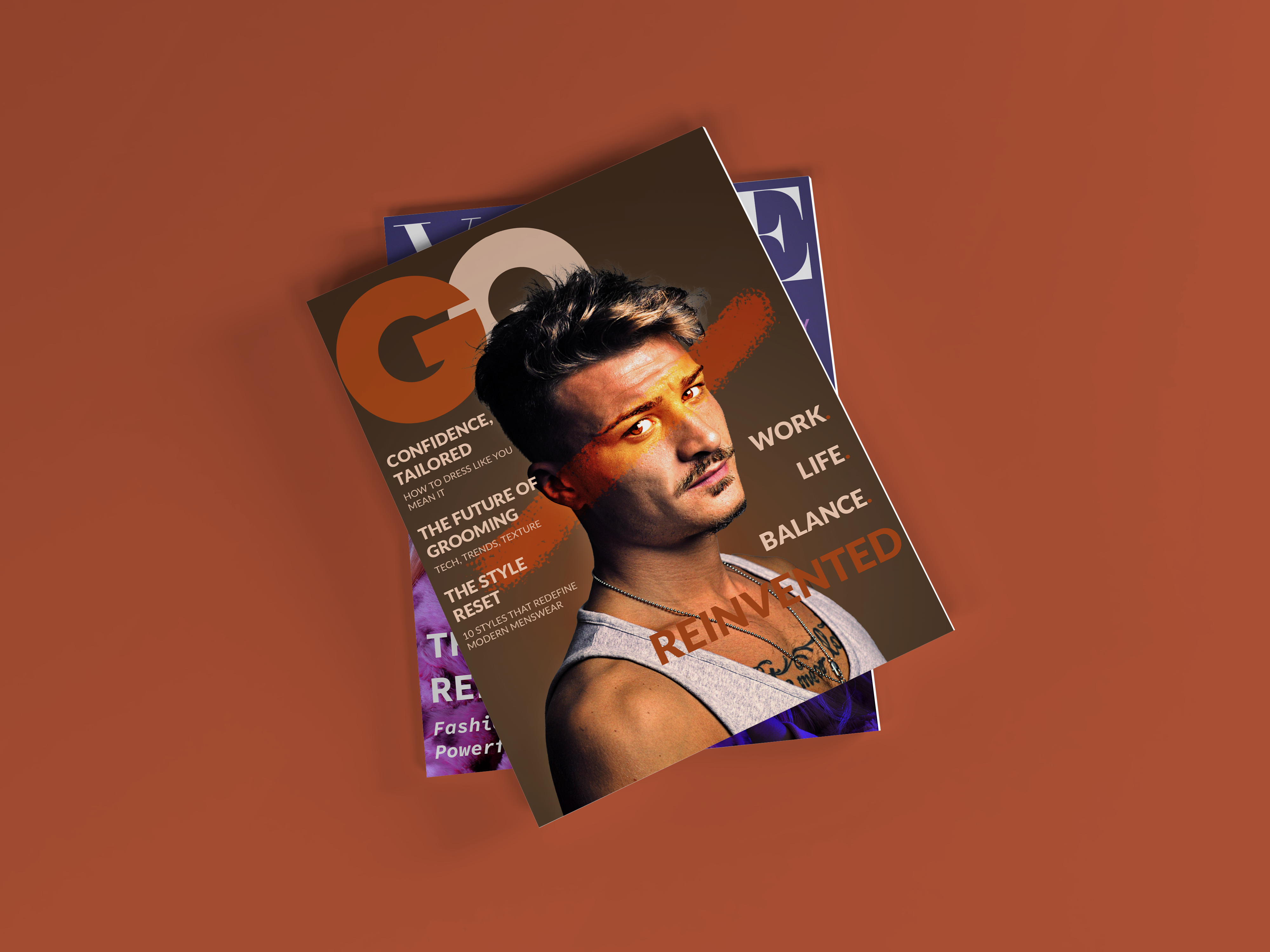
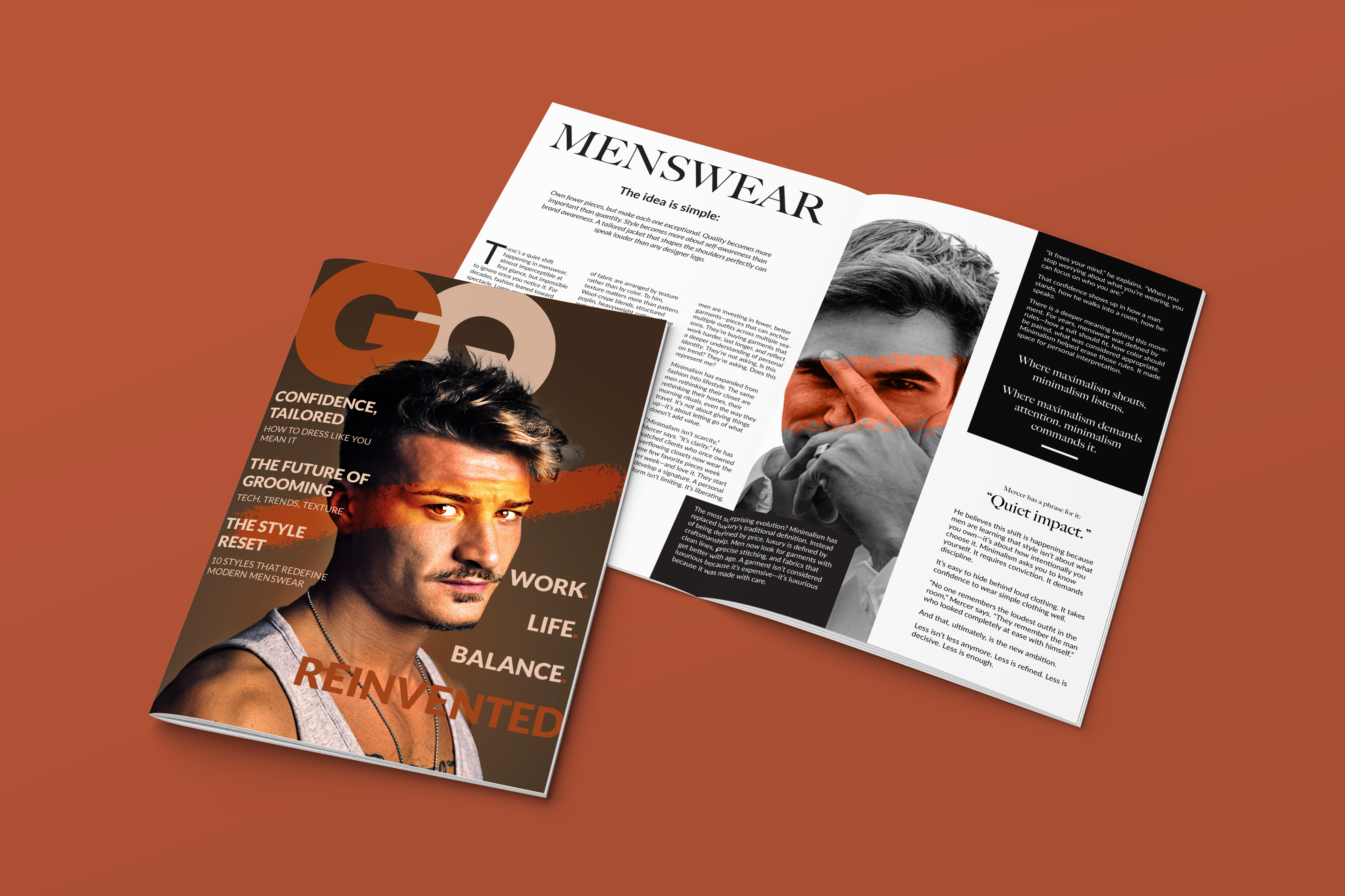
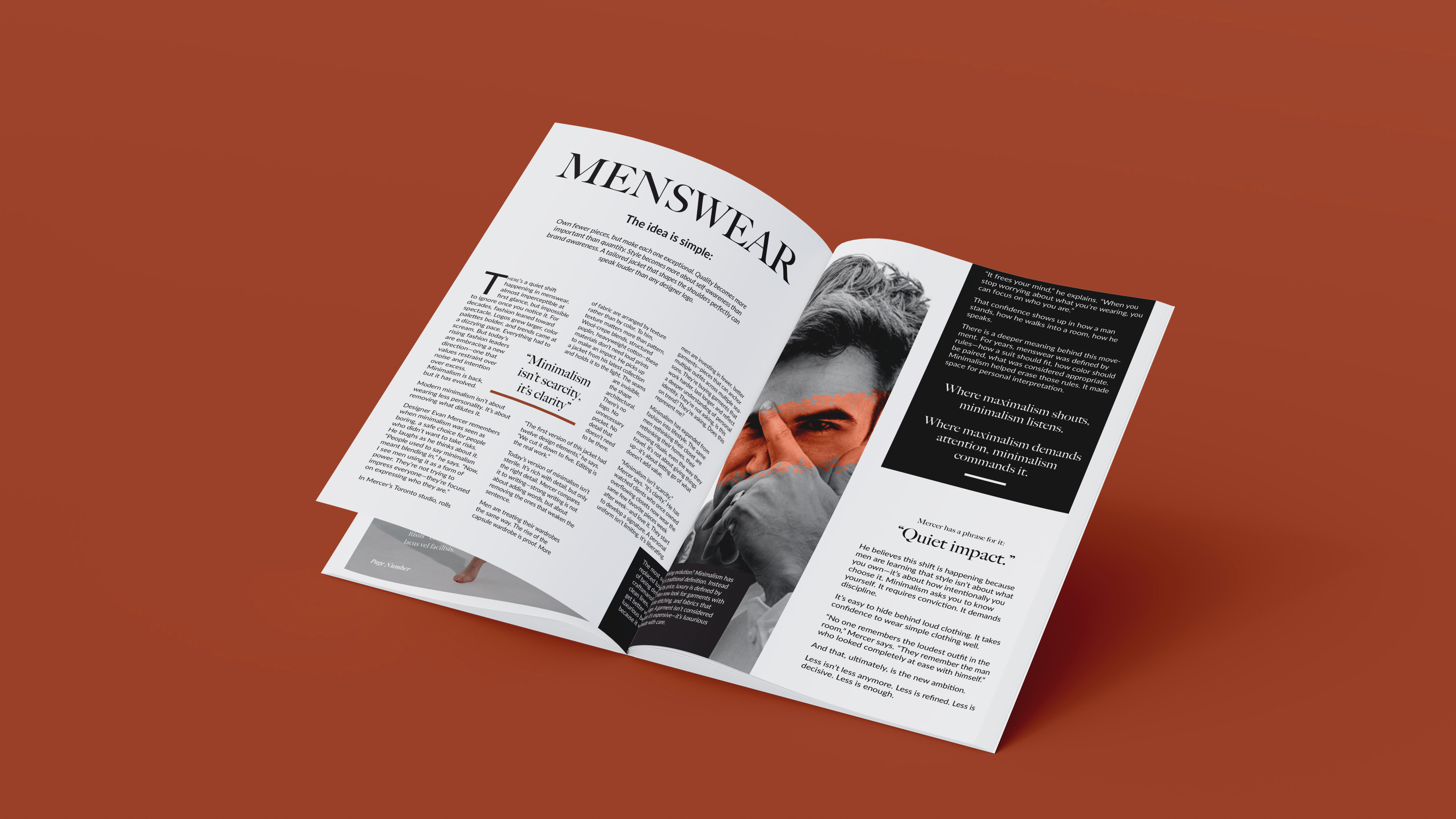
GQ
Designing for a GQ-inspired editorial layout required a stronger focus on bold hierarchy, structured composition, and high-impact visual storytelling. Unlike the softer and more restrained layouts associated with fashion-focused editorials such as Vogue, GQ layouts often emphasize confident typography, layered compositions, and a more direct relationship between imagery and written content. Because of this, the design needed to balance strong masculine visual identity with readability and clean editorial flow.
Special attention was given to the use of grid systems, alignment, and typographic scale to reflect the publication’s recognizable layout structure. Large headlines, structured columns, and image-driven compositions were intentionally incorporated to create a dynamic and visually engaging reading experience while maintaining the polished professionalism associated with GQ. The project explored how editorial design can communicate confidence, personality, and tone through bold hierarchy, spacing, and carefully curated visual pacing across a publication spread.


REAL
IDEAS MADE
kaitlyncutting12344@gmail.com
Location
Ontario, Canada