adventure crunch
cereal box design
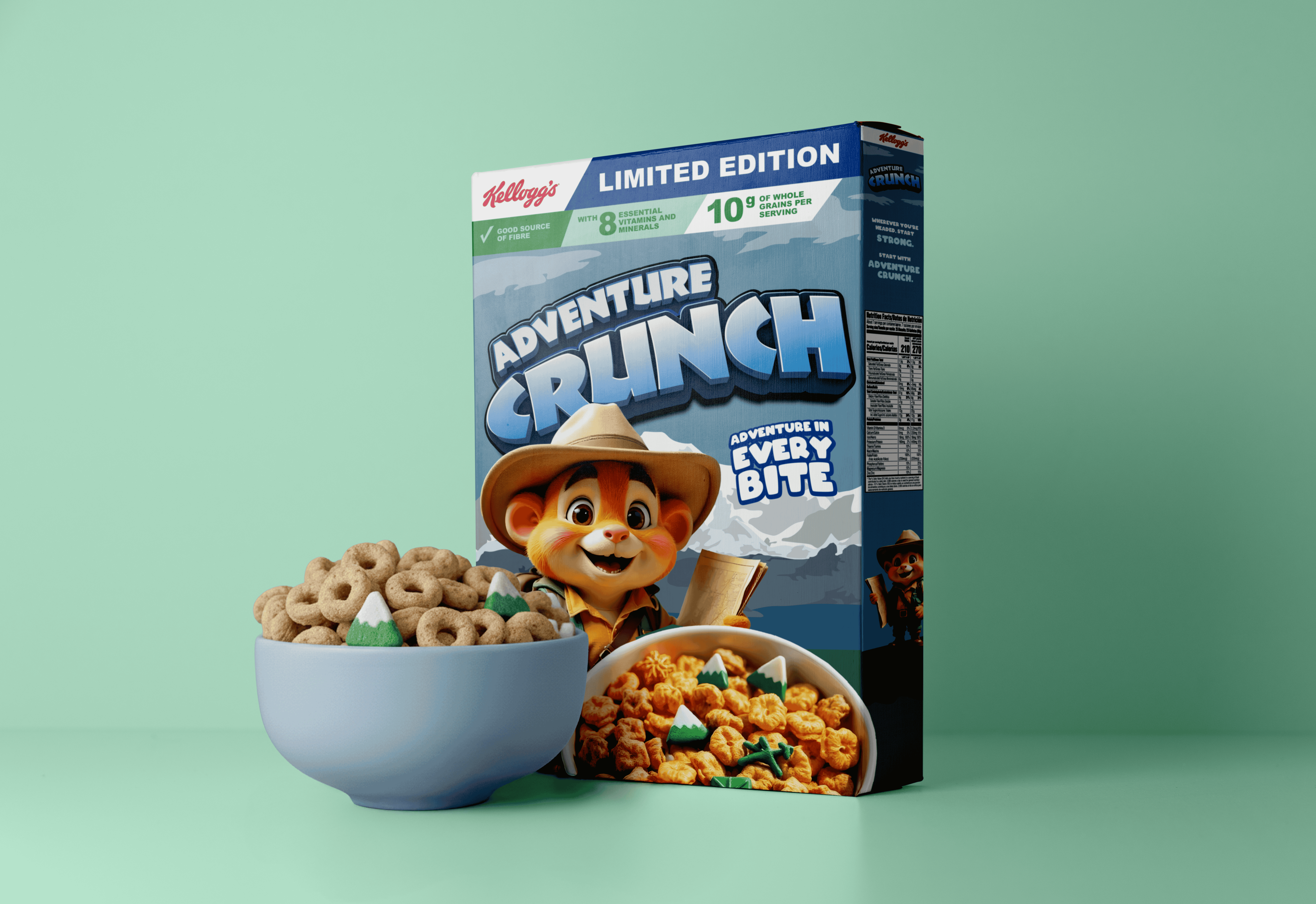
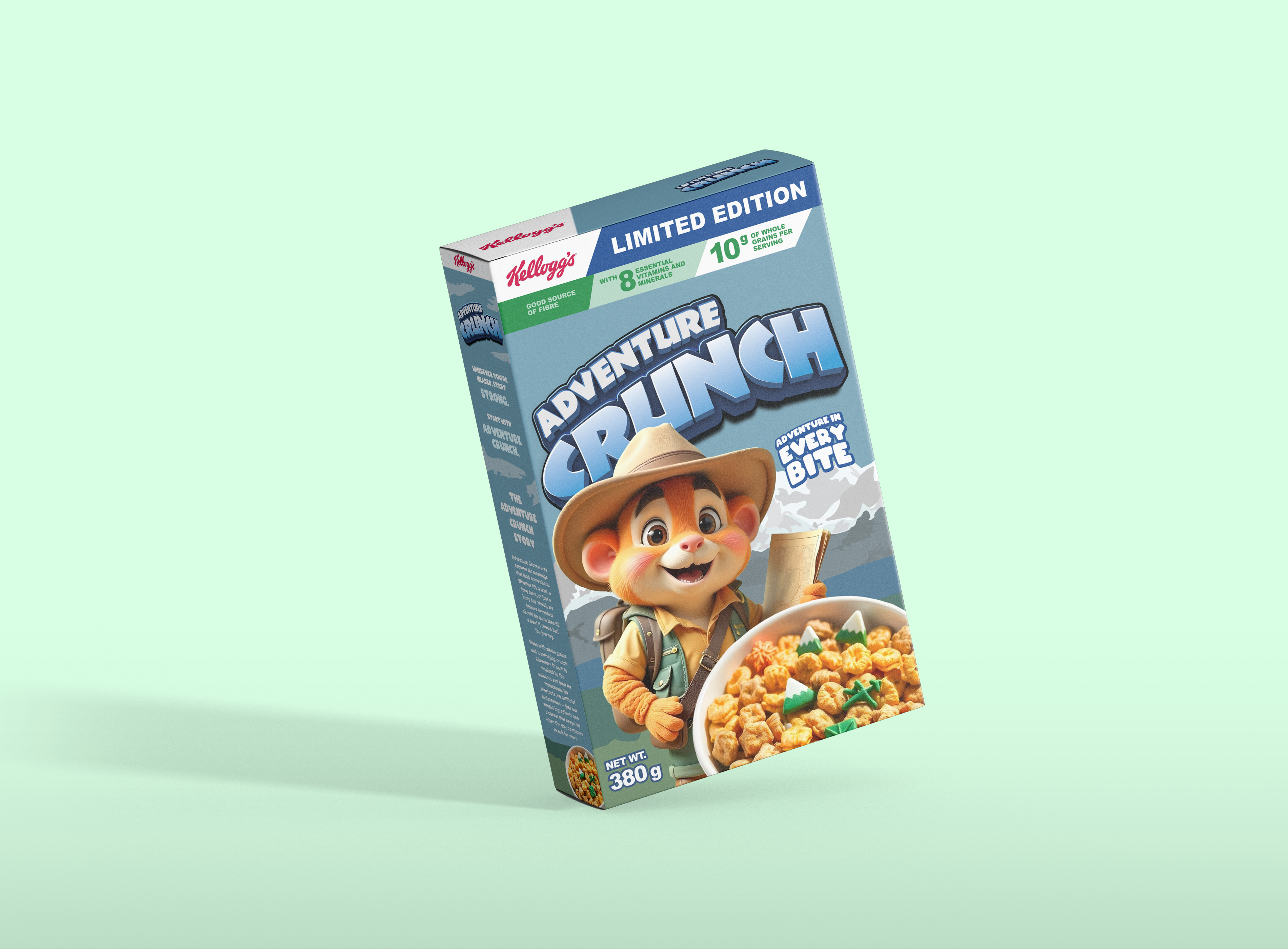
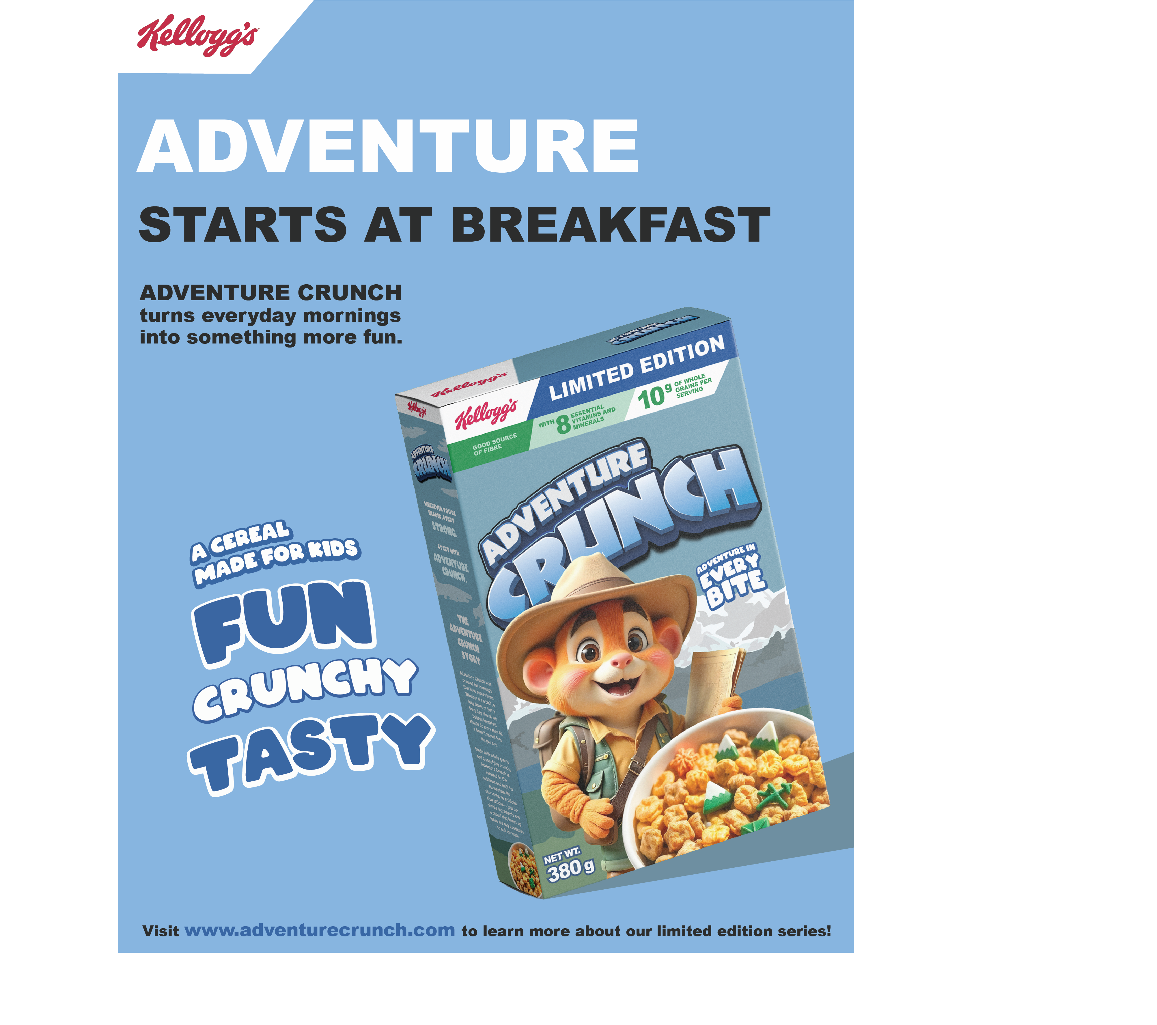
The objective behind Adventure Crunch was to create a cereal packaging design targeted toward children and families while developing a strong and memorable brand identity. The project focused on balancing hierarchy, readability, and shelf appeal through energetic visuals and adventure-inspired branding.
Design Decisions
The design decisions throughout Adventure Crunch focused on creating strong shelf appeal through bold hierarchy, engaging typography, and visually balanced composition. Layout and branding choices were intentionally designed to feel energetic and approachable while maintaining readability and clear product communication throughout the packaging.
The overall visual identity aimed to create a memorable cereal brand that felt cohesive, exciting, and visually engaging for younger audiences and families.
The development of Adventure Crunch focused on creating a packaging system that felt energetic, adventurous, and visually engaging for younger audiences. Inspired by themes of exploration and activity, the project explored how typography, layout, and branding could create a stronger emotional connection between consumers and the product.
The slogan, “Adventure in every bite” became a major influence throughout the design process, helping establish the adventurous and energetic tone of the brand identity.
Final Design
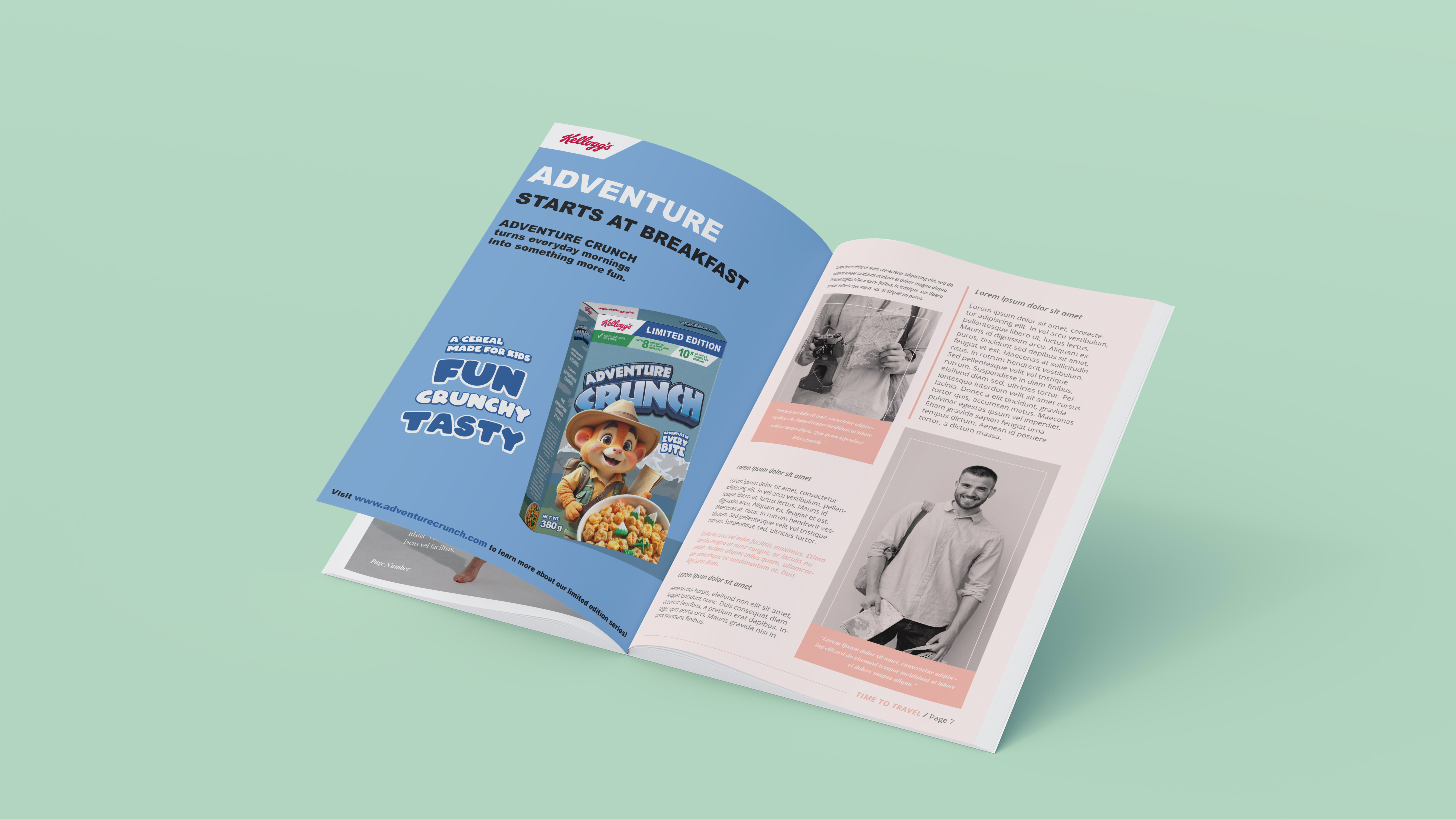
The final Adventure Crunch packaging design explored how branding and packaging can create stronger audience engagement through personality-driven visuals and clear visual communication. Through its adventure-inspired identity and energetic design approach, the project demonstrates how thoughtful packaging design can create memorable consumer experiences while maintaining strong hierarchy and shelf visibility.


REAL
IDEAS MADE
kaitlyncutting12344@gmail.com
Location
Ontario, Canada