FLI ATHLETICS
The objective behind the FLI Athletics project was to create a high-energy athletic branding and advertising campaign focused on performance, movement, and modern sportswear aesthetics. The project explored how branding, advertising, packaging, and promotional design can work together to create a cohesive athletic identity capable of standing out within a competitive sportswear market. Through the development of advertisements, packaging systems, and promotional materials, the project aimed to create a visually impactful brand experience that reflected speed, energy, and athletic performance.
Design Decisions
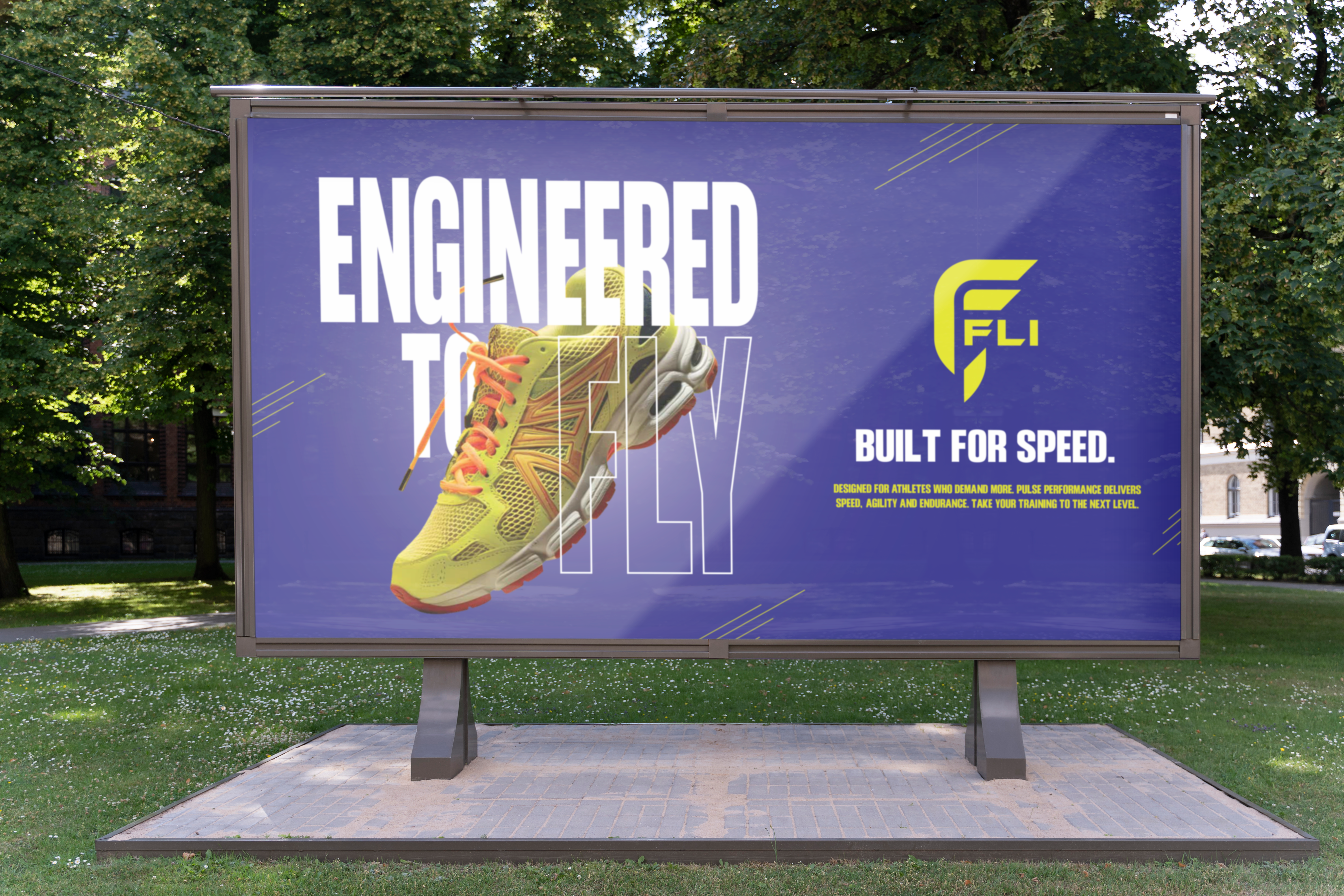
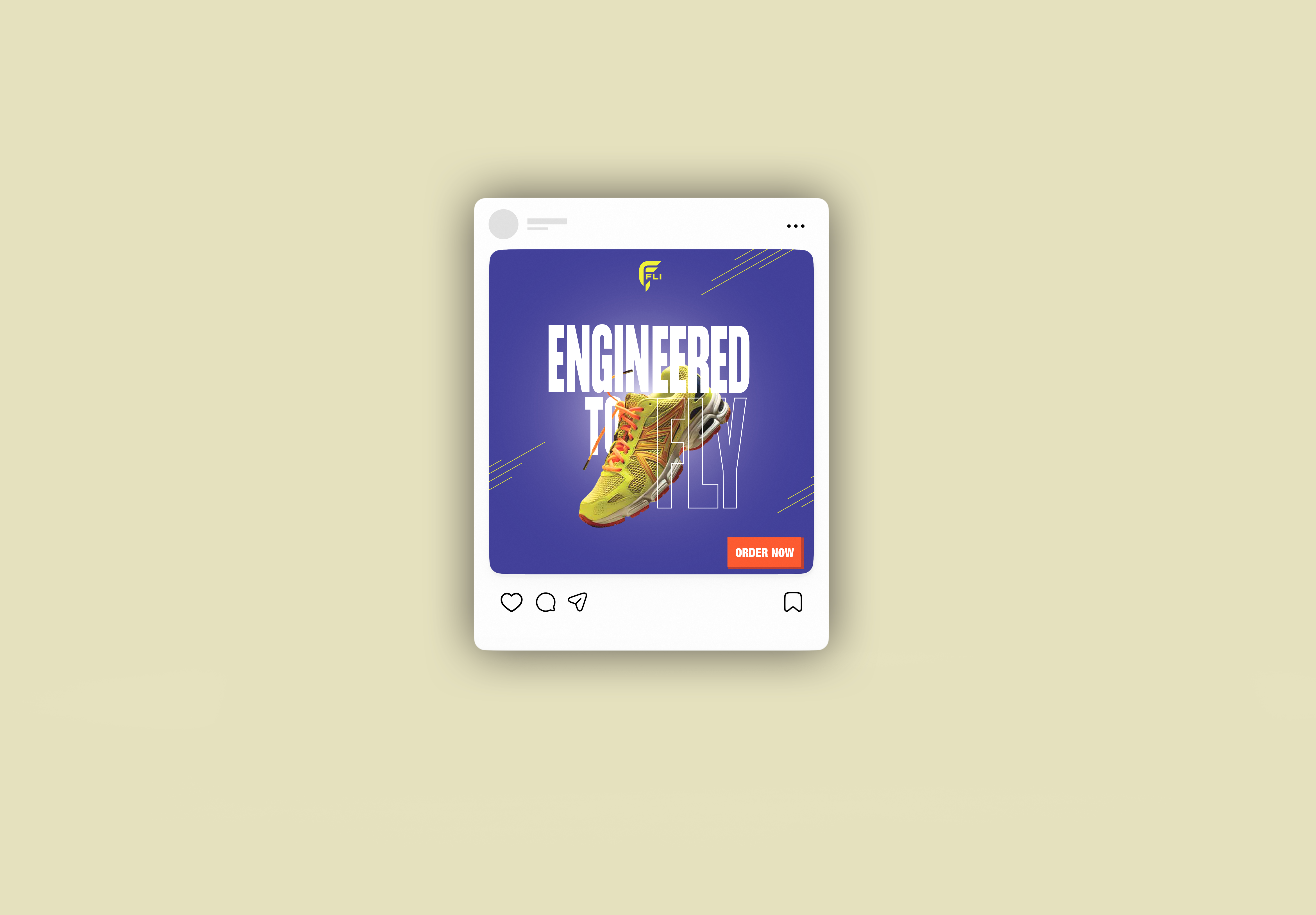
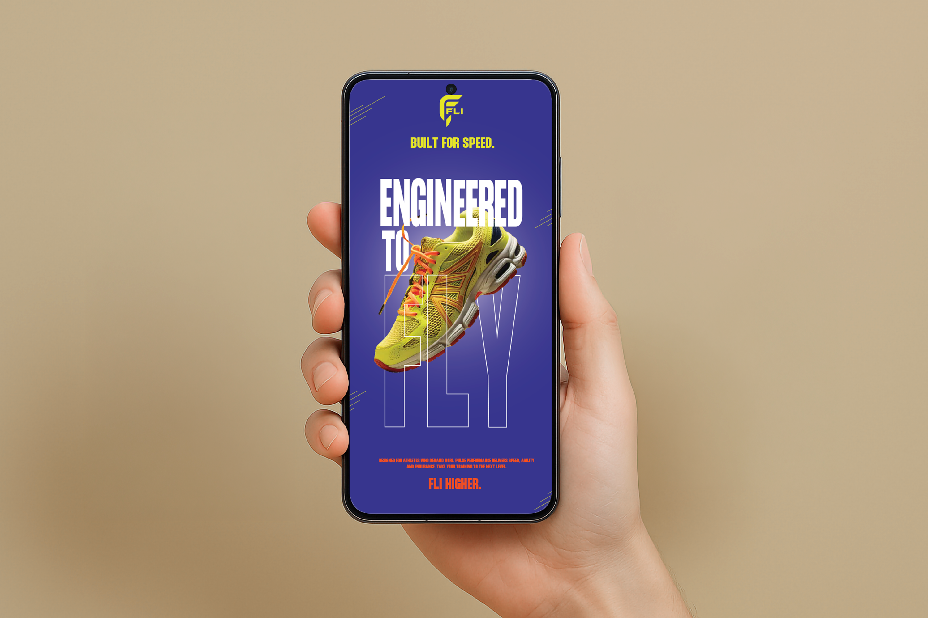
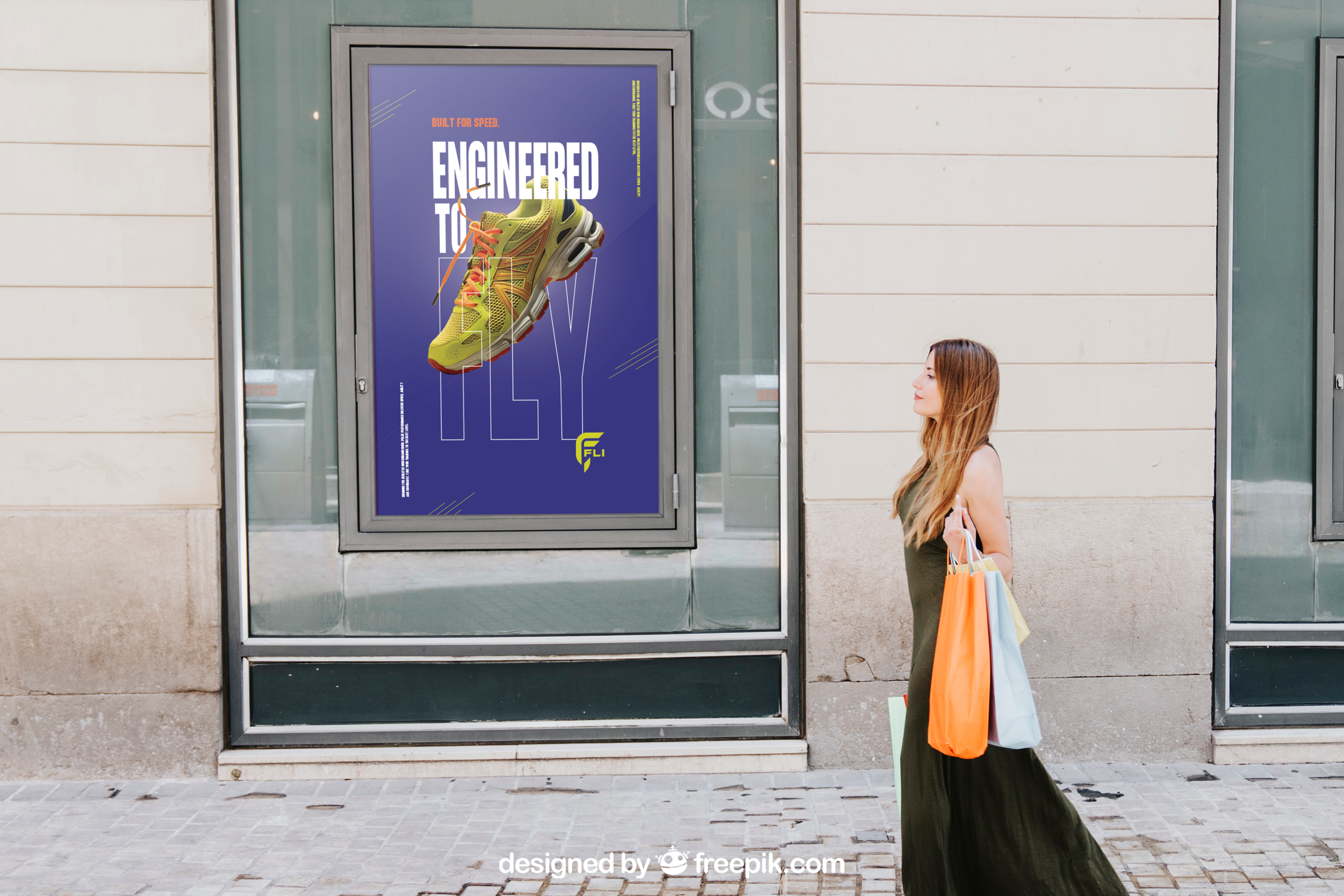
FLI Athletics focused heavily on hierarchy, movement, and creating a sleek, performance-driven visual identity. Bold typography, dynamic compositions, and high-impact layouts were intentionally used to create a sense of speed and energy throughout the campaign materials. The overall visual system aimed to feel modern, athletic, and commercially believable while maintaining strong readability and brand cohesion.
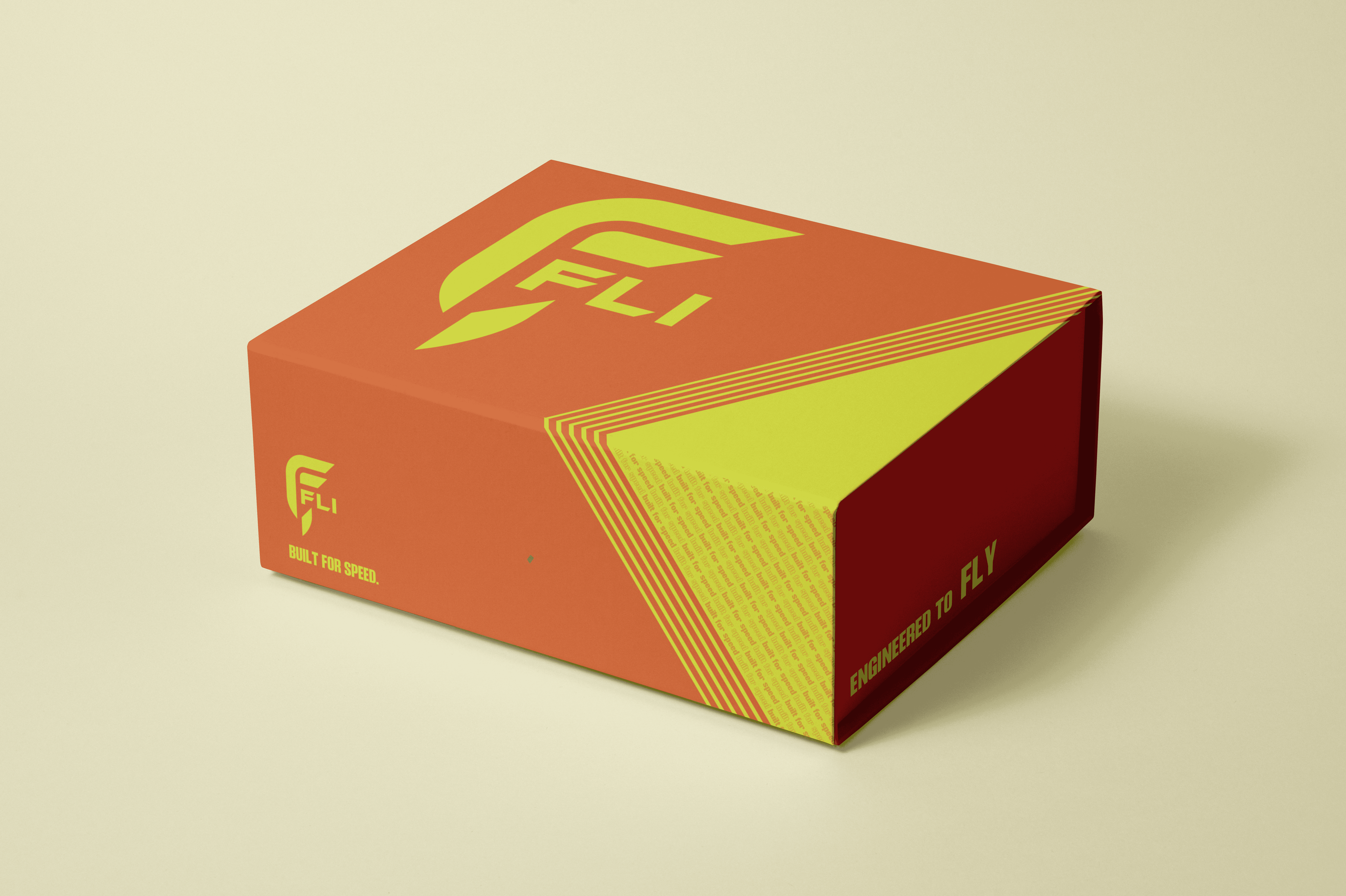
Special consideration was also given to the relationship between advertising and packaging design. Rather than simply repeating advertisement graphics directly onto the shoebox packaging, the packaging system was designed to complement the campaign while maintaining its own clean and functional visual identity. This allowed the advertisements to remain visually impactful while ensuring the packaging still felt connected to the larger brand ecosystem.
Initital Concepts
The development of FLI Athletics began with exploring how sportswear advertising utilizes movement, hierarchy, and bold visual identity to create emotional engagement with audiences.
Early concepts focused heavily on themes of speed, momentum, and performance, leading to the exploration of strong typographic slogans such as “Built for Speed” and “Engineered to Fly.” These concepts helped establish the campaign’s energetic tone and reinforced the idea of athletic performance being connected to motion and elevation.
The project also explored how different deliverables, including advertisements, showroom banners, sell sheets, and packaging systems, could maintain a unified brand identity while still functioning independently.
Rather than duplicating visuals across every application, the design direction focused on allowing each piece to support the overall identity while serving its own purpose within the campaign.
Final Design
The final FLI Athletics campaign explored how branding and advertising design can create a cohesive athletic identity through movement-focused visuals, strong hierarchy, and performance-driven messaging. By combining promotional advertising, packaging design, and brand-focused layouts, the project demonstrated how multiple design applications can work together to strengthen audience recognition and emotional engagement within a sportswear brand.
Through its bold visual language and energetic composition, FLI Athletics showcases how thoughtful branding and advertising design can communicate speed, confidence, and athletic performance while maintaining consistency across a full campaign system.


REAL
IDEAS MADE
kaitlyncutting12344@gmail.com
Location
Ontario, Canada