project BRIEF
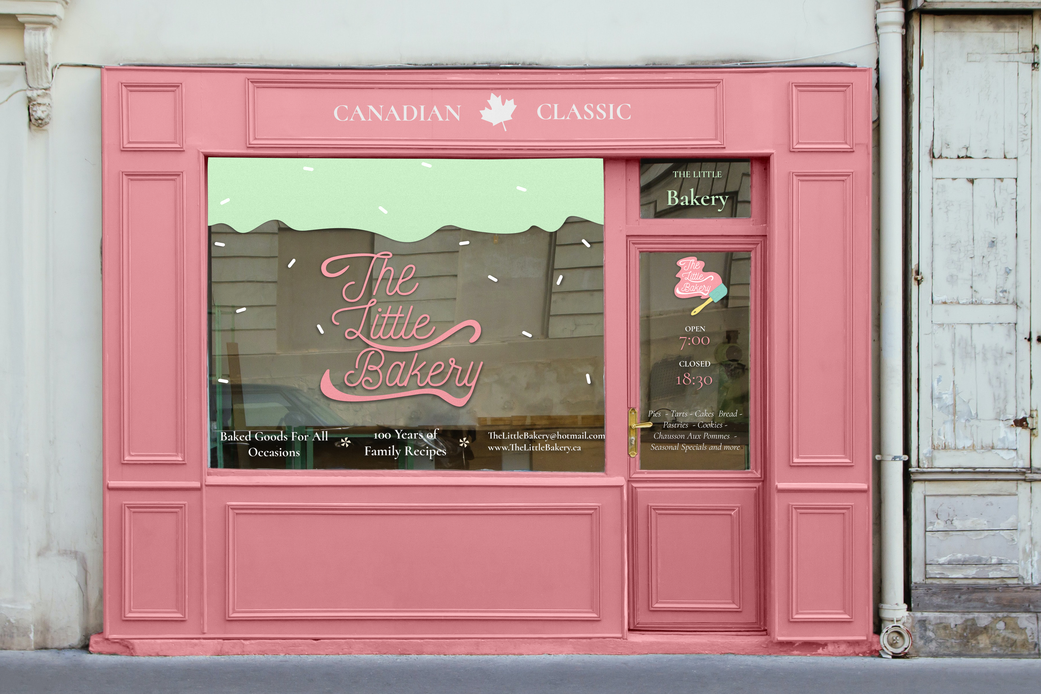
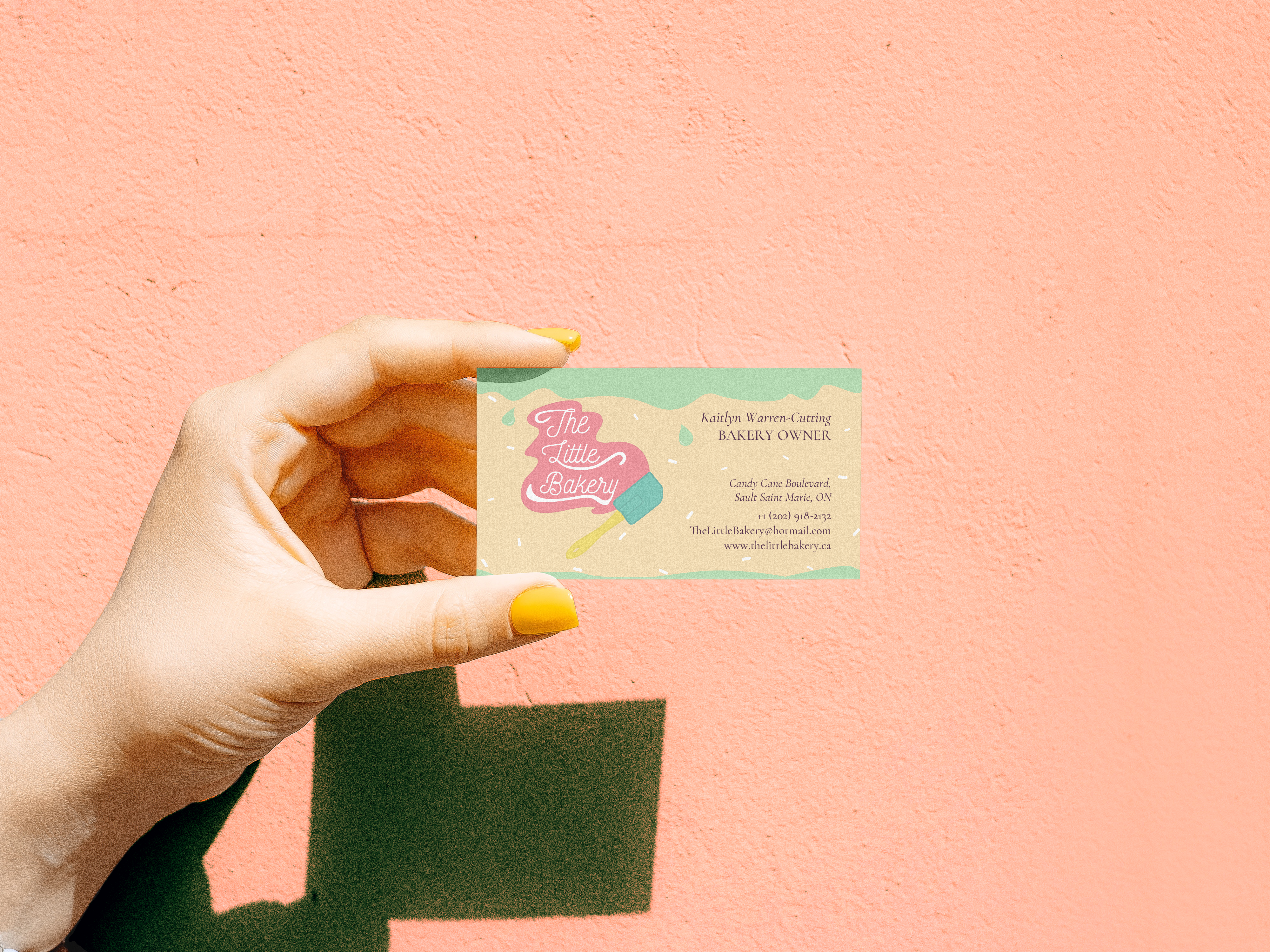
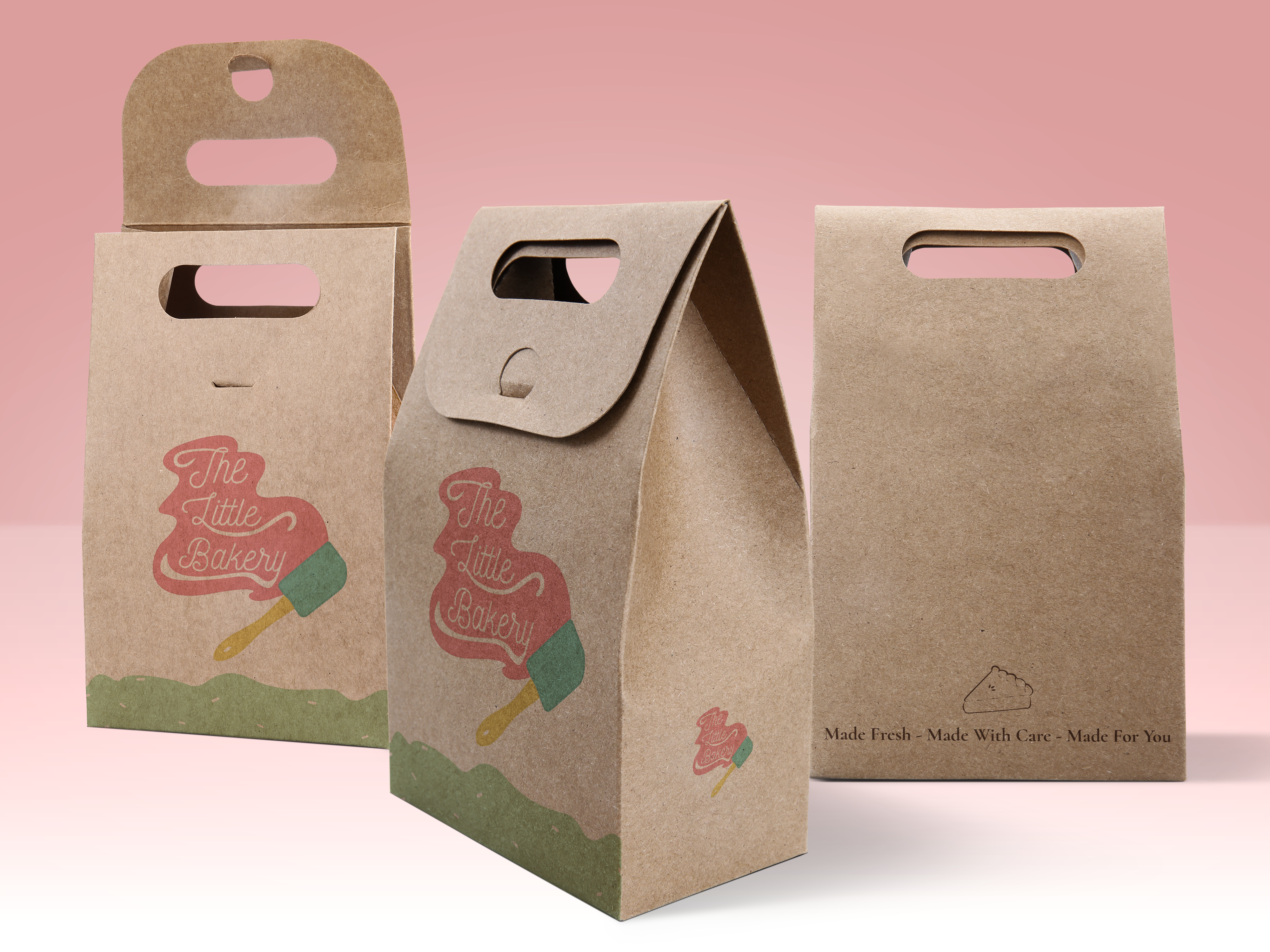
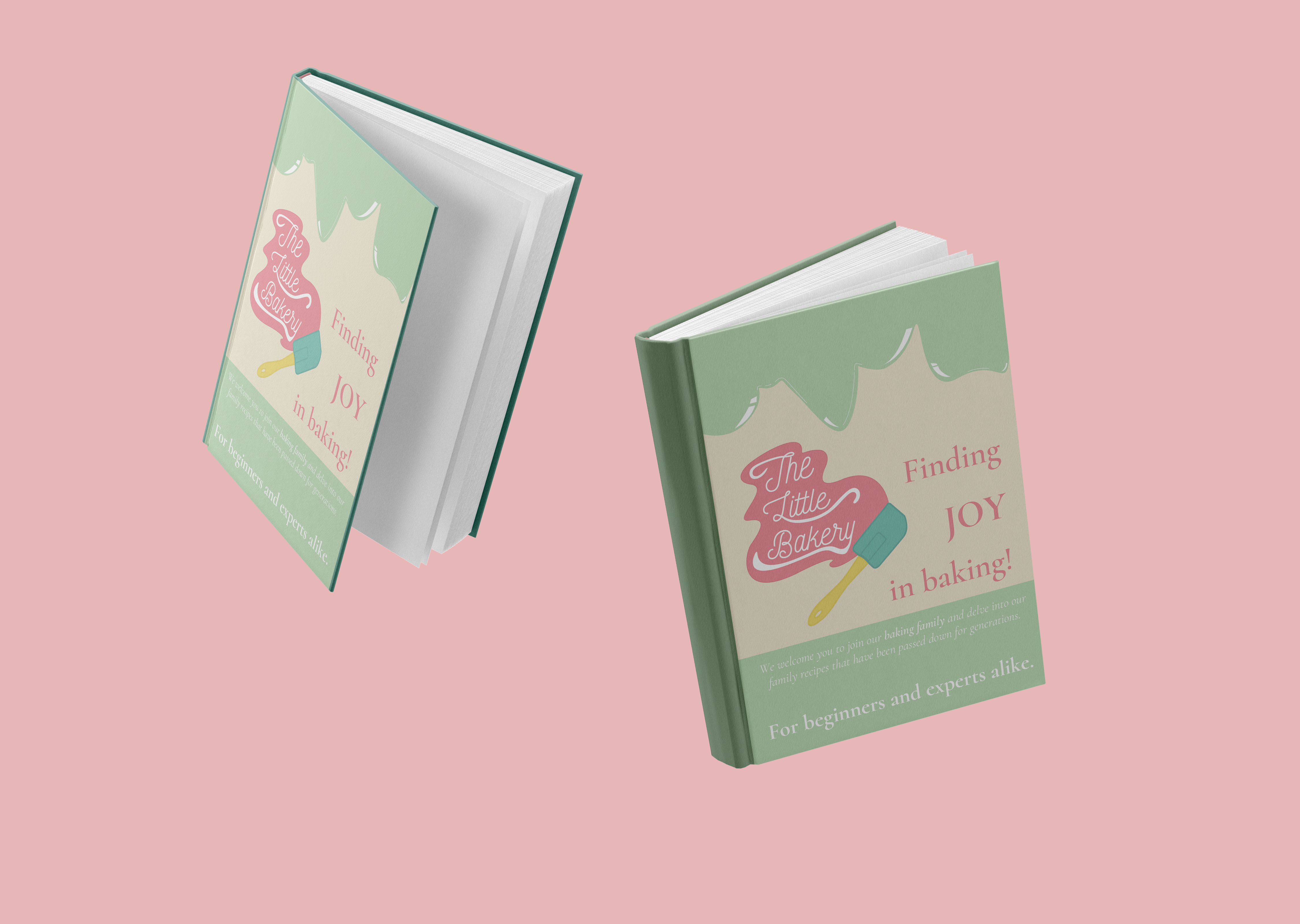
Created in the second semester of my first year, the intent behind The Little Bakery was to create a welcoming and personality-driven brand identity that reflected the bakery’s long-standing family history while adapting to a more modern audience. The project focused on balancing traditional values such as affordability, comfort, and community with a refreshed visual identity that still felt approachable, warm, and authentic to the bakery’s nearly 100-year legacy.
Design decisions were guided by the bakery’s emphasis on personalization, customer connection, and maintaining a safe and welcoming atmosphere for all audiences. The visual direction aimed to blend classic and modern influences through inviting colours, approachable typography, and balanced layouts that reflected both the handcrafted nature of the bakery and its evolving identity. Overall, the project explored how branding can preserve the history and emotional connection of a long-standing business while helping it remain relevant and engaging for newer generations.
RESEARCH
The design direction for The Little Bakery was heavily influenced by competitor research and the visual language commonly used throughout bakery branding. Research showed that many bakery logos utilize open-form layouts, soft linework, and imagery associated with baked goods or baking culture to create approachable and recognizable identities. While these similarities helped establish common industry standards, the goal of this project was to create a brand identity that still felt visually unique while reflecting the bakery’s personality and values.
Design decisions focused on creating a lighter and more spacious visual identity through the use of open composition, subtle linework, and soft colour palettes inspired by the project’s mood board. Rather than focusing on a single baked item, the concept explored showcasing a variety of baked goods to emphasize the bakery’s versatility and welcoming atmosphere. Balancing familiarity and comfort with a more modern and personalized visual approach.
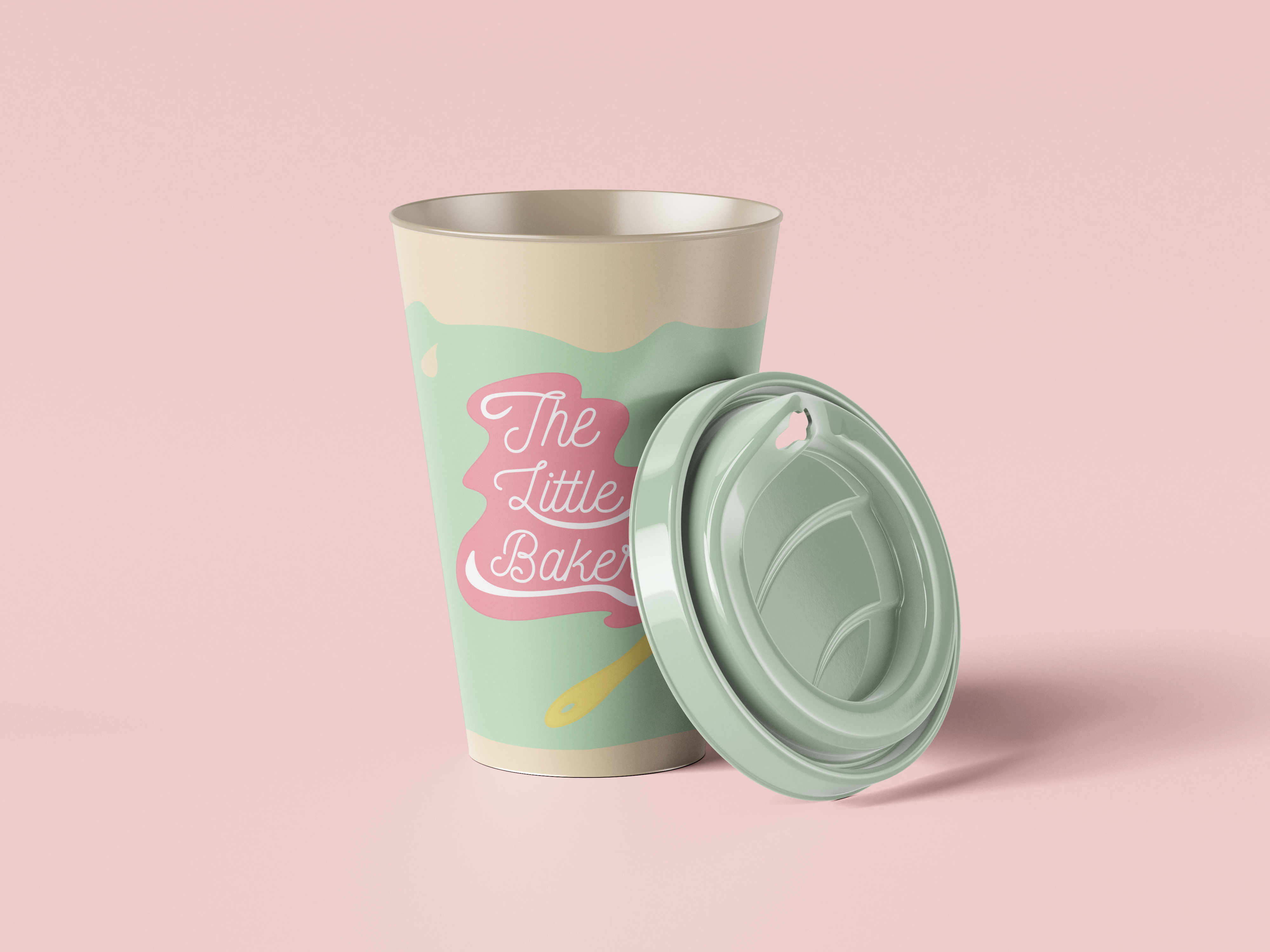
The primary colours used throughout the brand identity were selected to create a fun, welcoming, and modern atmosphere that reflects the bakery’s warm and community-focused personality. Soft pastel tones were chosen to maintain a light and approachable aesthetic, while slightly darker variations of those colours were incorporated to help emphasize borders, improve contrast, and create stronger visual definition throughout the design system.
Maintaining softer and more muted tones is important to preserving the overall visual identity of the brand, and such an approach helps ensure consistency across all applications while reinforcing the bakery’s friendly, inviting, and contemporary appearance.



REAL
IDEAS MADE
kaitlyncutting12344@gmail.com
Location
Ontario, Canada